Round but angular.
Straight and stable, yet smooth:
A low contrast sans-serif type family for
display and editorial use.


About this Typeface
Maschek grotesk is a versatile and distinctive type family specifically designed for display and editorial use. It radiates a clear and reliable stability in accordance with a soft and warm appearance. Its letterform proportions and construction details result in a trustworthy and serious yet friendly personality – garnished with a pinch of humor.
While the heavy weights are perfectly suited for impactful display use, the well balanced text weights achieve remarkable legibility results. The large character set of 936 glyphs per style offers extended latin language support as well as various OpenType features such as small caps, case sensitive forms, 12 different figure sets, 9 stylistic sets, fractions, contextual alternates and many more.
This type family consists of 22 fonts: eleven weights plus corresponding italics, offering
a wide range from razorblade
thin to well balanced text weights
and even expressive ultra-fat display styles.

Hover for Italics!
↓


Watch Variable Font!
↓


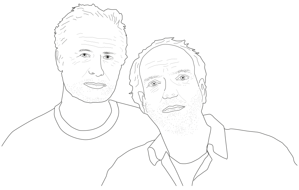
Two-thirds of the Austrian comedian trio »Maschek«: Peter Hörmanseder & Robert Stachel.*
Why Maschek, why grotesk?
»Maschek« is a specific Viennese term meaning something like »other« or »otherness«, deriving from the hungarian word »másik«. People in Vienna say someone comes from the »maschek-side« referring to the back side or the other side, or when things are done in a different way than expected.
It is also the name of an austrian comedy trio, well-known for their absurd-grotesque satirical live voice-overs of tv-footage. Developed from hand-crafted letterings for their posters and flyers, this typeface is scheduled to become Maschek’s official »corporate typeface« in the near future, and will consequently be showcased in all of the comedians’ print-, web- and
In German language use »grotesk« is the general term for sans serif typefaces (including, but not limited to »grotesques«). Furthermore the adjective »grotesk« means preposterous or bizarre, »[…], and thus is often used to describe weird shapes and distorted forms …« (Wikipedia – grotesque)
These are attributes that match both, the comedians‘ exploits – creating grotesque situations – , as well as how the letterforms are constructed: When you closely look at Maschek Grotesk’s curves you will notice that every curvature includes a corner somewhere. That’s just like squaring the circle. Grotesque, isn’t it? Similarily the typeface’s stems are neither soley angular nor rounded. Rather they have influences from both sides: the usual one and the »maschek-side«.

Affectionately constructed with passion
and hand-carved precision.
And there’s even more going on behind the
scenes – have a look at some of
Maschek Grotesk’s technical aspects:


About the Designer
Stefan Biedermann is a type designer from Vienna/Austria.
While dedicating his life to music for many years, he had an international standing as a
So far he has produced a few display fonts for private use and clients such as the famed German football club

For more detailed information about »Maschek Grotesk«
and extended text-setting examples
please have a look at the pdf-specimen or get in contact:
office[at]stefanbiedermann.com
all rights reserved – Stefan Biedermann 2021
*Maschek Illustration drawn by Birgit Biedermann-Eschenlor / studioeschenlor.com
More info about the comedians »Maschek«: www.maschek.org
Thanks to Stefan Willerstorfer for providing assistance in phrasing the texts, Tommy Allamoda for translations into English,
everyone from the Viennese »Typo-Stammtisch« for their valuable input, Johannes Lang, the Glyphs-forum, Peter and Robert (Maschek), Elmar Schmidinger, and to my family.
Extra special thanks to my wife Birgit and my daughter Emma.